Thursday 31 March 2011

Self defined Brief - Adam Batchelor


I found Adam Batchelor's work the other day. I just loved how simple his compositions are but still manages to get a strong message across. For this story I'm telling, I don't want too much typography in it, I want the images to kind of tell it on their own, so Adam's work is a really useful reference.


Wednesday 30 March 2011

Self defined Brief - Anthony Micallef


Anthony Micallef's work is amazing! This is exactly the sort of direction I want to take my work. I'm thinking maybe this 'book' I want to create could simply be like a a series of works which could be removed from their context. But together they tell a story. Like how photographs are kept in an album.

I need to start finding reference images and paint over my drawings in this kind of style.

Self Defined Brief - Idea and Victor Sloane


For this new, self defined project. We can pretty much do what we want as long as we can meet the criteria. I want to create a narrative for a story currently in the news. It really annoys me how different authorities, whether thats the police, council, the army etc, create rules and laws for us to follow, which they think they are immune to. They abuse their power, but then they're protected by their own people so they get away with it.

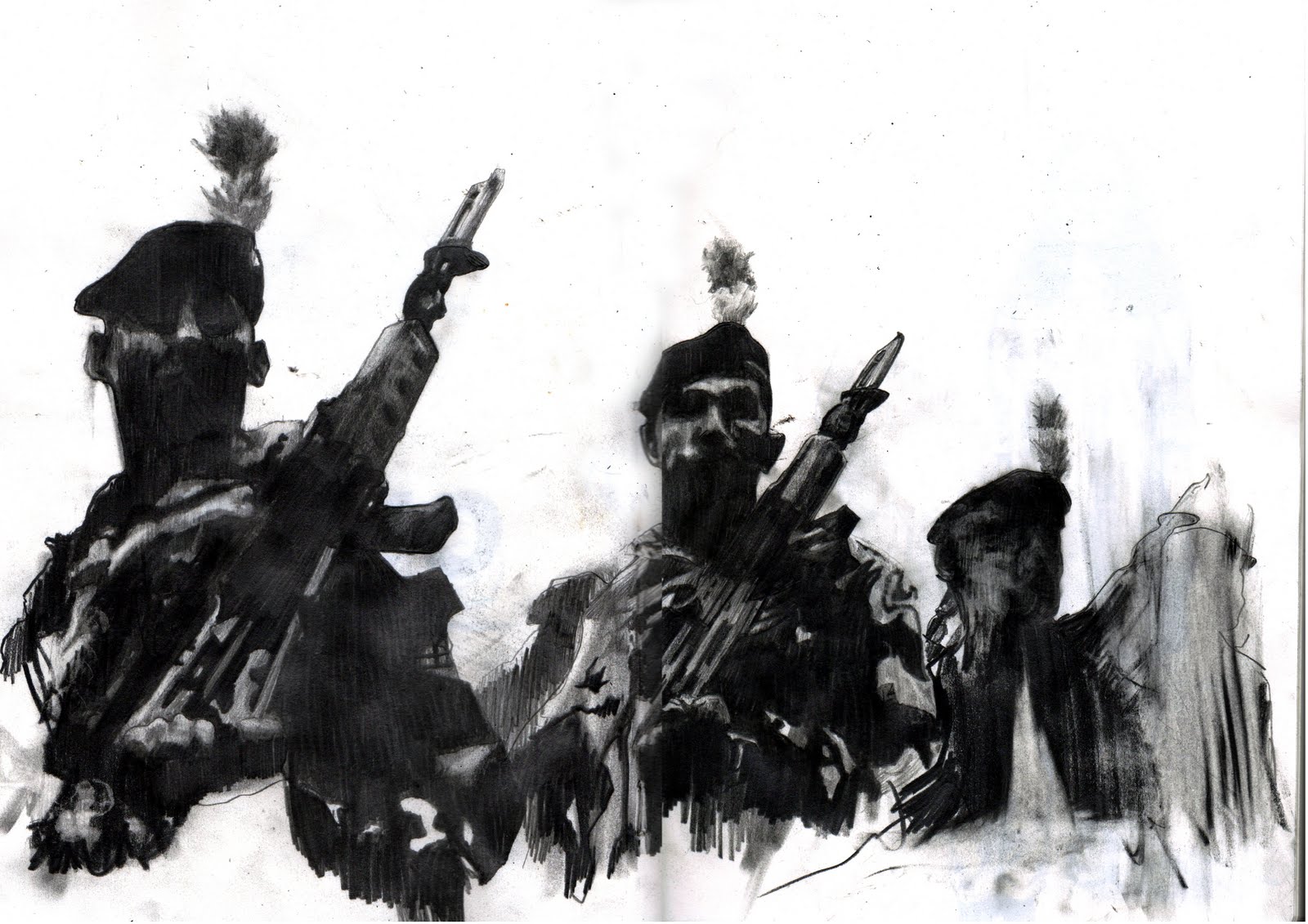
I'm still not 100% sure of where to go with this, but there has been articles in the newspapers recently about Majella O'Hare, a 12 year - old girl who was shot dead by British Paras in Northern Ireland, 1976. The soldier who did it seemed to have had no reason for doing this, yet got acquitted at court after being protected by the British army. Only now, 35 years on, has the government apologised for what happened, and admitted to wrong doing. This is just an idea, but the theme of abusing power is something I will pursue.

I need to go around bookshops in London such as Magma, to find new ways of creating books. I want this to be different to a normal book. To create a new way to show this narrative.

I've started looking at artists and photographers, and Victor Sloan is one of the best I've found so far. His style of working would fit this story perfectly.

Tuesday 29 March 2011

Cuts Exhibition Work


Here is my work I exhibited in an exhibition the other week at Space 54 with my fellow illustration students. It was a great week! Hopefully we'll do another one soon. I do have a couple of prints I'm planning on selling, whether its on etsy or here, so if anyone is interested let me know.

Sunday 27 March 2011

Finished Typeface

Here's the finished typeface. I'm fairly pleased with it. It is quite simple (which was the intention) and although it was based on shapes from drain covers, you can't really see that. Which in a way I'm pleased with, it's just been a good starting point.

Typeface - A-F


I have started making my alphabet out of the different shapes from the drain covers. I've done it by enlarging them, reducing them in size and cutting them out and putting them together. I'm trying to keep a mixture of the rigid shapes and the more circular, negative spaces (like the holes in the drains). They're quite bold which is good because I'm aiming to use it possibly on business cards so it needs to be readable on a small scale.

Typeface Photos


For the typeface project I'm doing I've been taking photos of drain covers. It's a bit weird but I wanted to use photography of things you see everyday. I started taking pictures just of the ground every thirty seconds or so to record my journey home from uni, and noticed the different shapes and patterns you get on them. It's strange you see them everyday but don't take any notice of them. I'm probably going to do the letters as collage from the photos above. So I'll just cut the shapes out that I need.

Saturday 26 March 2011

Typeface Project - 'Pick me up' at Somerset House


I went to the 'Pick me up' art fair yesterday and there was so much amazing work! I got a lot of ideas for my typeface project I'm working on. I want to create a typeface that I can use on my blog, website and on business cards etc, to make them all a bit more interesting and give my work a stronger identity. So it was good going to 'Pick me up' to see how other artists use typography.

One artist there who stood out for me was McBess. His use of type and the variety in shape and size makes his work so much more interesting. This is something I really need to work on.

Thursday 17 March 2011

Front Cover of Zine

This is the cover for my zine. I forgot to put it up with the others! Quite a simple one, made from my sixth photo which I didn't use in the end. It's qiute a good choice because it's just a regular photo of something you see everyday, which is how I'm trying to depict Letchworth - just a bog standard place.

Final Zine


These are the final pages for my zine. I think it shows the story pretty well. There's text in there which will help tell the story. It's not all readable but thats not really the point. I've used some text as another method of mark making, so only certain words will stand out.

This project has been so useful. To have to work so quickly with limited images. It helps keep a certain theme running, rather than using loads of different imagery.


Wednesday 16 March 2011

Zine work


Here are a couple of double pages I've been working on for the zine. I still need to add the typography to them which will make them easier to understand.

David Hockney - 'Rake's Progress'


I have been doing some research for a project I have to make an 8 page zine. I only have three days to do it in so I need to be working quickly. I have done quite a bit of research though and these works by David Hockney seem to stand out. They're quite simple compositions yet really highlight the story well. This is how I need to be working!

Tuesday 15 March 2011

Zine work


These are some pictures I am going to be using for a zine I am working on. You always think that the place you are from is a dump, and you can't wait to get away, to somewhere better. But then when you do, you realise that nearly everywhere is the same. It's just the norm. The bottom image is Luton (near my home), the laundrette is Wealdstone (where I live now) and the others is Kilburn (where my mates live). All different places but could easily be the same place!

Monday 14 March 2011

Website Roughs


This is a rough design of the main page of my website. I want an illustration of some kind next to the title, which I will work on.


A design for the 'work' pages of the site. I tried to keep this as simple as possible.


'Contacts' bit sort of explains itself, but these are the general ideas of how the site would work.


Wednesday 9 March 2011

Cuts work


Just a drawing I'll be working with in response to the Defence cuts.